Icon Buttons
You can add icons to your buttons using one of the following options.
SVG icon
link SVG iconUse a link wrapper (Oxygen) or div (Bricks), insert your SVG code using a code block (Oxygen) or a code element (Bricks). Add the o-btn class to the container. OxyProps will take care of styling the SVG as the button icon.
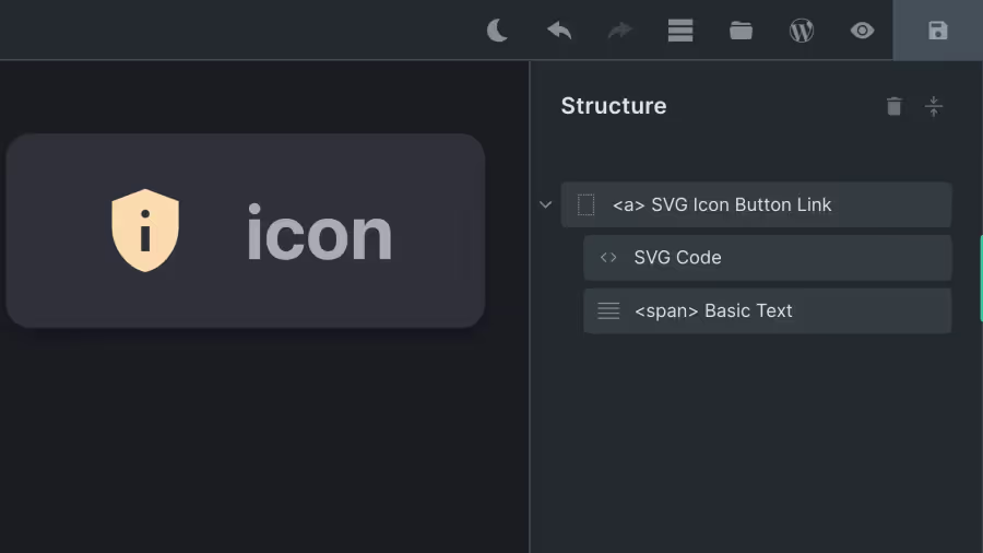
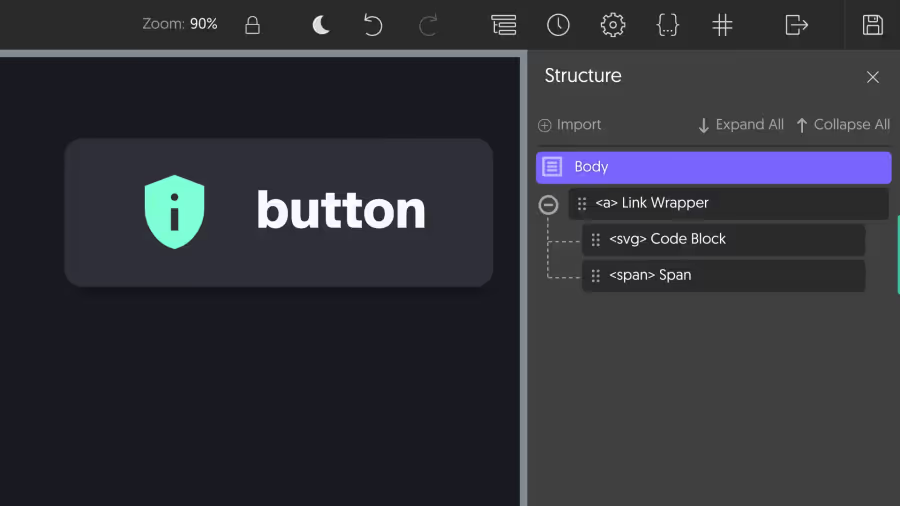
<a href="#" class="o-btn"> <svg xmlns="http://www.w3.org/2000/svg" viewBox="0 0 24 24" width="24px" height="24px" > <path d="M11 17h2v-6h-2v6Zm1-8q.425 0 .713-.288T13 8q0-.425-.288-.713T12 7q-.425 0-.713.288T11 8q0 .425.288.713T12 9Zm0 13q-3.475-.875-5.738-3.988T4 11.1V5l8-3l8 3v6.1q0 3.8-2.263 6.913T12 22Z" /> </svg> button</a>CSS icon
link CSS iconStep 1
link Step 1Browse the icon library of your choice and copy the URL of the icon you want to use. In this example, we will use the Iconify library.
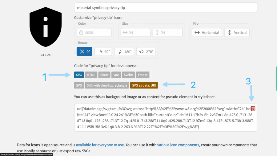
Once you have found your icon:
- Click the SVG button.
- Click the SVG as data: URI button.
- Click the copy button to copy the code to your clipboard.
Step 2
link Step 2Create a custom CSS rule in your global CSS using the following model. This way, you insert the SVG code once and can reuse it without duplication.
[data-icon="icon-name"] { --o_data-icon: url('data:image/svg+xml,%3Csvg xmlns="http%3A%2F%2Fwww.w3.org%2F2000%2Fsvg" width="24" height="24" viewBox="0 0 24 24"%3E%3Cpath fill="currentColor" d="M11 17h2v-6h-2v6Zm1-8q.425 0 .713-.288T13 8q0-.425-.288-.713T12 7q-.425 0-.713.288T11 8q0 .425.288.713T12 9Zm0 13q-3.475-.875-5.738-3.988T4 11.1V5l8-3l8 3v6.1q0 3.8-2.263 6.913T12 22Z"%2F%3E%3C%2Fsvg%3E') center / contain no-repeat;}Step 3
link Step 3Add the icon to the button by inserting an element with the data-icon attribute and the icon-name value. This can be a span or a div element.
<a href="#" class="o-btn"> <span data-icon="icon-name"></span> button</a>