Quick Start Guide
Are you ready to take your productivity to the next level? If so, OxyProps is the tool you’ve been waiting for. Whether you’re a busy professional or a freelancer looking to streamline your workflow, OxyProps can help you get more done in less time. To help you get started, here are a few simple steps to follow after installing the software:
Dashboard
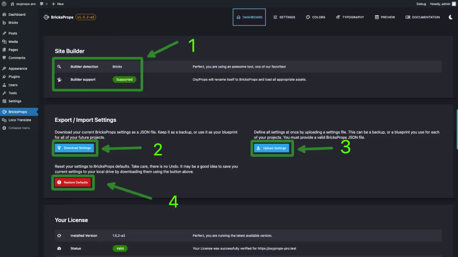
link DashboardThe OxyProps dashboard is the place where you can manage your OxyProps settings. To access the dashboard, click on the OxyProps icon in the WordPress admin menu bar.
On the dashboard home page, you will find:
- The detected site builder and its compatibility with OxyProps.
- The Download Settings button. To download you settigns in a JSON file.
- The Upload Settings button. To upload a JSON file with your settings. This is handy to share your settings with your team or to import settings from another site.
- The Reset Settings button. To reset your settings to the default values.
Settings
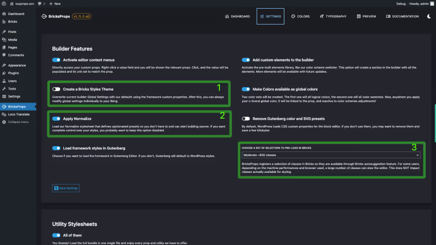
link SettingsIn the settings page, you will find the “Builder Features” section. This is where you can enable or disable the OxyProps features for your site builder. The settigns will slightly differ depending on the site builder you are using.
We will not dive into all settings, but ss a quick start, I want to highlight a few of them.
-
Create a Bricks Styles Theme.
Disabled by default - Activation recommended.
Unless you are installing OxyProps on an existing site with existing styles, enable this feature. When enabled, OxyProps will create a new theme in the Bricks Theme Styles feature. This theme will contain the default minimal OxyProps styles. You can then use this theme as a starting point for your own theme and safely tweak any initial setting to fit your need. -
Apply normalize.
Enabled by default - Activation recommended.
Normalize is an opinionated stylesheet that sets a lot of small detail styles so you don’t have to. For example, it sets maximum length for the text elements (headings and paragraphs), it applies you color scheme to html elements, it gives default outlines for keyboard navugation, etc. If you are the kind of developper that want full control and no presets, you may want to disable it by unchecking this box. -
Choose a set of selectors to preload in Bricks.
Large ~2000 classes by default - I recommend you choose the biggest one.
There was a time when Bricks did struggle when a high number of classes where registered in the editor. For users experiencing slowdowns in the editor, this option allows to reduce the number of pre-registered classes to improve performances. If you are not experiencing any slowdowns, you can choose the highest value. It is important to understand that this setting only impacts Bricks autosuggestion feature. If a class is not pre-registered, it will still be available in the editor, but you will have to type it manually.
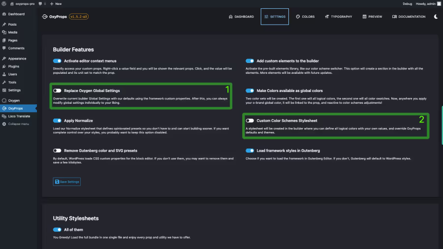
- Replace Oxygen Global Settings. Disabled by default - Activation recommended. Unless you are installing OxyProps on an existing site with existing Global Settings, enable this feature. When enabled, OxyProps will populate Oxygen Global Settings with the framework defaults. This will set the default minimal OxyProps styles like fluid font sizes or responsive links colors. You can then safely tweak any initial setting to fit your need. You can restore the defaults by unchecking this option, save, then re-check it and save again. But be aware that this will reset all your Oxygen Global Settings to the default OxyProps values. 2. Apply normalize. Enabled by default - Activation recommended. Normalize is an opinionated stylesheet that sets a lot of small detail styles so you don’t have to. For example, it sets maximum length for the text elements (headings and paragraphs), it applies you color scheme to html elements, it gives default outlines for keyboard navugation, etc. If you are the kind of developper that want full control and no presets, you may want to disable it by unchecking this box.
Setting up your color scheme
link Setting up your color schemeColor schemes
link Color schemesOxyProps offers a versatile color management system, allowing you to choose from pre-set OxyProps colors or define your own custom color scheme. Here’s how you can get started:
First, Navigate to the “Colors” page in OxyProps dashboard. You will find first the section “Color schemes”. This is where you can choose if you want your site to use a light or dark color scheme.
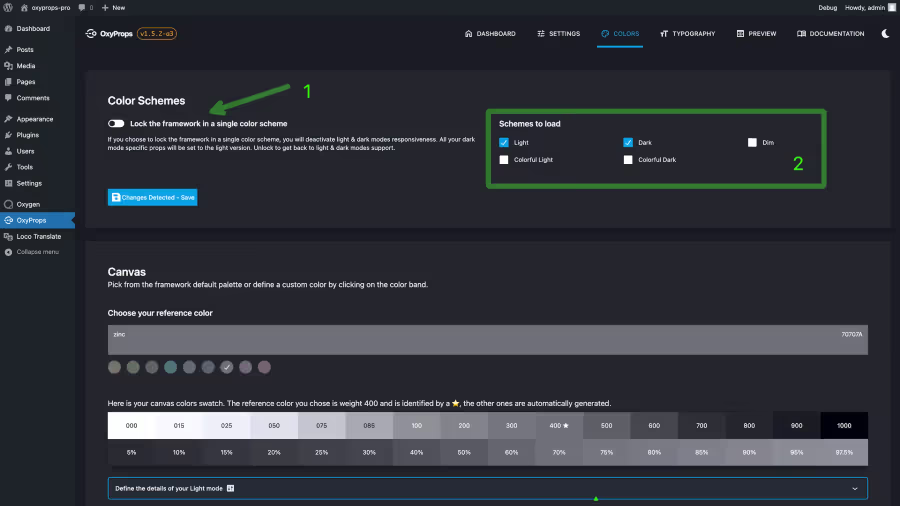
- This switch allows you to lock the framework in light mode only.
- If the #1 switch is off, you can choose which color schemes you want OxyProps to create. You can choose between light, dark, dim, colorful light, colorful dark.
Logical colors
link Logical colorsTo ensure your colors are responsive, OxyProps uses logical colors, a set of 5 colors that define the color scheme for your site. These logical colors are mapped to the actual colors and shades you choose in the “Colors” section:
- Canvas is the default color for backgrounds and text. It is usually a neutral color with low saturation.
- Brand is your primary brand color.
- Accent is your secondary accent color.
- Links is the default color for text links and buttons, serving as the action color for your site.
- Visited is the default color for visited links, but feel free to use it in any way you want!
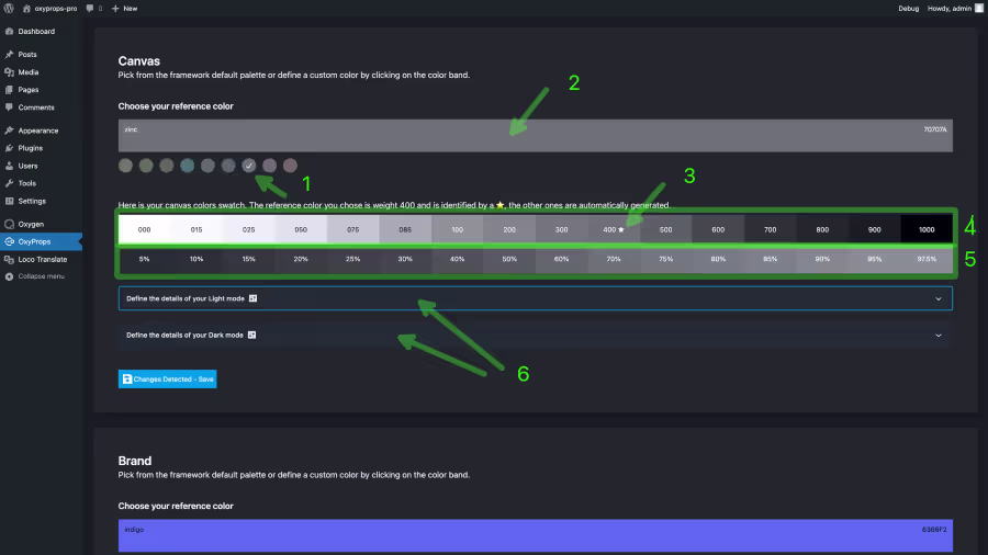
For each logical color, you will define a reference color. OxyProps will map you reference color to the closest shade in the OxyProps color shades scale. Then, it will generate all other shades automatically to populate all shades from 000 to 1000.
Setting you canvas reference color.
link Setting you canvas reference color.The canvas logical color is the default color for backgrounds and text. It is usually a neutral color with low saturation.
From the canvas logical color, you will choose whish shades to assign to the surface 1, surface 2, surface 3, surface 4, text 1, text 2 logical colors.
- Surface 1 is the default color for your site background.
- Surface 2 is the default color for backgrounds with an elevation above surface 1.
- Surface 3 is the default color for backgrounds with an elevation above surface 2.
- Surface 4 is the default color for backgrounds with an elevation above surface 3.
- Text 1 is the default color for headings.
- Text 2 is the default color for body text.
- Choose a preset color.
Defaults to Zinc which is#70707A
Oxyprops offers a choice of 9 neutral color presets. All of them are colors with low saturation. They are not pure greys. You can choose any of them by clicking the color sample in the palette, and clickSave Changes. - Set your custom color.
If you want to set your own custom color, you can do so by clicking the wide color band. This will open a color picker where you can choose any color you want. You can also type the hex code of the color you want to use. - Identify the shade for your reference color.
When you select a color, OxyProps generates the full color swatch and maps your reference color to the closest Luminance value. You will notice your reference color is marked with a ★. In the exemple visible on the screenshot, the reference color is shade 400 of the canvas swatch. The CSS variable--o-canvas-400is the reference color for the canvas logical color and has the exact value you entered. All other shades are calculated automatically. - Preview the full color swatch.
The first line displays the 16 available shades with their values. - Preview transaparencies.
When you hover over a shade, the second line will reflect 16 different levels of transparency for that shade. This is useful to preview the opacity of a color. - Define color schemes.
When you are happy with your reference color, you can define the details of your color schemes. Click on one of theDefine the details of your Light modeorDefine the details of your Dark modebuttons to expand the panel.
Setting your color schemes
link Setting your color schemesWhen you are happy with your reference color, you can define the details of your color schemes. Click on one of the Define the details of your Light mode or Define the details of your Dark mode buttons to expand the panel.
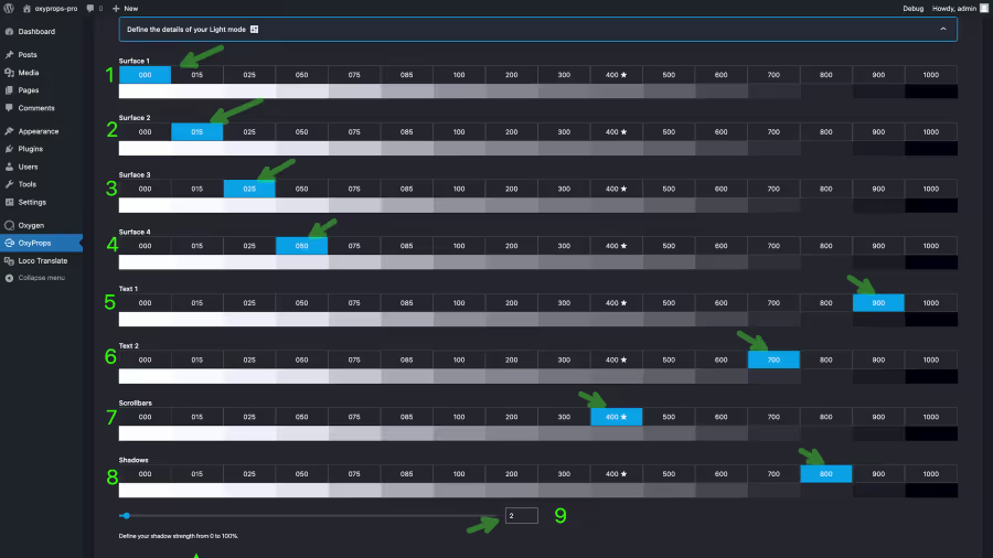
- Select the shade of your choice for defining Surface 1 for this color scheme.
- Select the shade of your choice for defining Surface 2 for this color scheme.
- Select the shade of your choice for defining Surface 3 for this color scheme.
- Select the shade of your choice for defining Surface 4 for this color scheme.
- Select the shade of your choice for defining Text 1 for this color scheme.
- Select the shade of your choice for defining Text 2 for this color scheme.
- Select the shade of your choice for defining the scrollbar for this color scheme. Applies to browsers that support the
scrollbar-colorCSS property. - Select the shade of your choice for defining the shadows color for this color scheme.
- Move the slider or input a value to define the shadows strength for this color scheme.
Check Accessibility of your selection
link Check Accessibility of your selectionOxyProps will check the accessibility of your selection and display the calculated contrast ratio between the text and the background as well as the rating agains WCAG 2.1 (current) and APCA (future WCAG 3) standards.
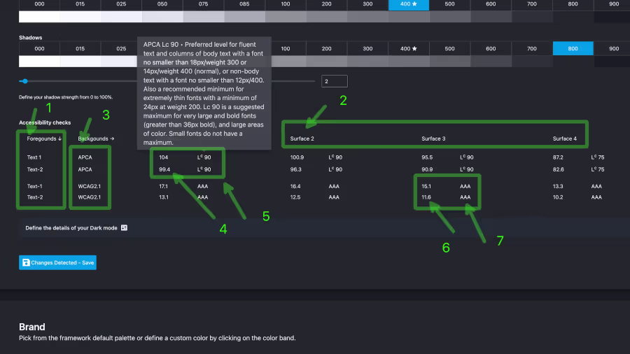
- Foreground colors are text 1 and text 2 as defined in your color scheme settings.
- Background colors are surface 1, 2, 3 and 4 as defined in your color scheme settings.
- APCA is the future WCAG 3 standard. It is not yet implemented in browsers, but it is a good idea to check your contrast ratio against it. WCAG 2.1 is the current WCAG standard. It is implemented in browsers and is the standard to check against for now.
- The contrast ratio is calculated automatically between the foreground and background colors. In this example, the APCA contrast is 104 for text-1 over surface-1 and 99.4 for text-2 over surface-1.
- These very good contrast values rate both text-1 and text-2 Lc90 over surfac-1 according to APCA. This means that both text-1 and text-2 are accessible on surface-1.
- Against WCAG 2.1, text-1 has a 15.1:1 contrast ratio and text-2 has a 11.6:1 contrast ratio.
- Both are rated AAA and are accessible.
Setting your brand, accent, links and visited colors
link Setting your brand, accent, links and visited colorsOnce you have defined your canvas color, you can define the other logical colors.
For each chromatic color, you will set the refernce color as you did for the canvas color. Then, you will define the shades for the normal state and for the hover state.
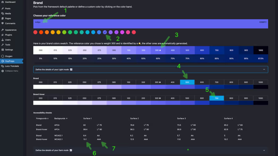
- Choose a preset color. In this example, we are setting the brand color to the
Indigopreset. - Or set your custom color. By clicking the color band.
- Identify the shade for your reference color. In this example, the reference color is shade 300 of the brand swatch.
- Select the shade for the normal state. In this example, we are setting the normal state to shade 500.
- Select the shade for the hover state. In this example, we are setting the hover state to shade 700 which will give a higher contrast against a light background.
- Accessibility check. Our hover state for the brand color has a WCAG 2.1 contrast ratio of 13.1:1 against surface 1. The normal state has a WCAG 2.1 contrast ratio of 6.4:1 against surface 1.
- WCAG 2.1 rating. The hover state is rated AAA and the normal state is rated AA. Both are accessible.
Setting up your typography
link Setting up your typographyYou can customize the fluid font sizes system by adjusting 5 parameters:
- Base font size: The base font size for your website.
- Font scale ratio: The scale ratio used to calculate the fluid font sizes.
- Mobile to Desktop ratio: The ratio between font sizes at smallets breakpoint and largest breakpoint.
- Absolute minimum size: The minimum font size whatever the screen size.
- Heading to subheading ratio: The ratio between a heading and its subheading font size.
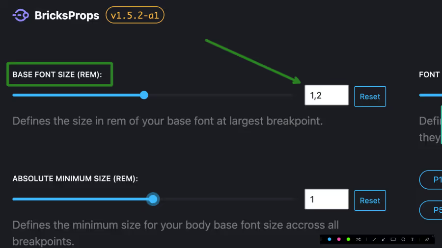
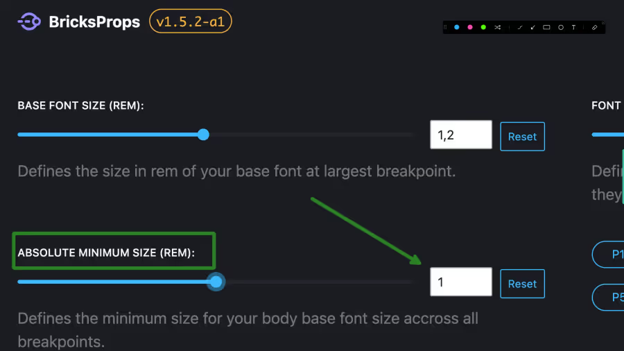
Base font size
link Base font sizeThis settings defines the base font size for your website. It will define the --o-fluid-font-0 <h6> headings. Its value is given in rems.
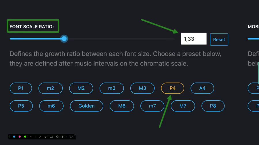
Font scale ratio
link Font scale ratioThis settings defines the scale ratio used to calculate all the fluid font sizes. Starting from the base font size, which is --o-fluid-font-0
In the following example, the font scale ratio is set to 1.33 which corresponds to the P4 (Perfect fourth) preset.
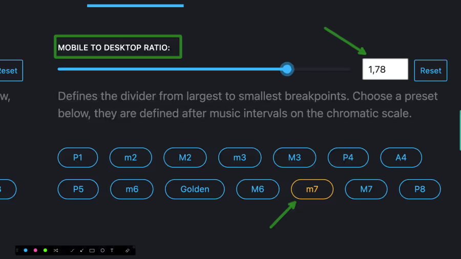
Mobile to Desktop ratio
link Mobile to Desktop ratioThis setting defines the ratio between font sizes at smallets breakpoint and largest breakpoint. This is useful when you want to have a different font size on mobile devices than on desktop devices. For example, you might want to have a smaller font size on mobile devices to make it easier to read.
If you set this value to 1, the font size will be the same on all devices. If you set it to 2, the font size will be half the size on mobile devices. Or in other words, the font size will be doubled on desktop devices.
In the following example, the mobile to desktop ratio is set to 1.78 which corresponds to the m7 (minor seventh) preset.
With this preset, if my desktop base font size is set to 1.2rem, the mobile base font size will be 1.2rem ÷ 1.78 = 0.67rem.
Absolute minimum size
link Absolute minimum sizeThis setting defines the minimum font size that can be used. This is useful when you want to prevent the font size from becoming too small on mobile devices. This is a hard stop in the calculations. For example, you might want to have a minimum font size of 0.9rem on mobile devices to make it easier to read.
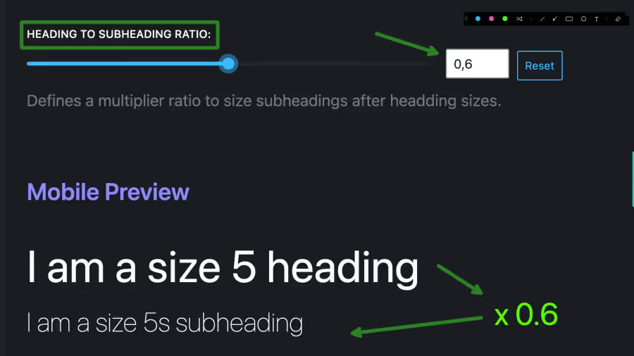
Heading to subheading ratio
link Heading to subheading ratioThis setting defines the ratio between heading font sizes and subheading font sizes. This is useful when you want to have a different font size for headings than for subheadings, and keep a constant ratio across all your heading levels.
In the following example, the heading to subheading ratio is set to 0.6. This means that the font size of a subheading will be 60% of the font size of the corresponding level heading.