Font Families
The font-family property in CSS is a powerful tool that allows web designers and developers to specify the font used for text content on a website. By setting the font-family property to a specific font, designers can control the visual appearance of text content and create a consistent visual identity for a website.
Choosing the right font family is crucial for creating a website that is both aesthetically pleasing and functional. Different font families can convey different moods and emotions, and some are more legible than others at different sizes and in different contexts.
In this section, we will explore the font families available in OxyProps, which can be easily used in your CSS styles or with utility classes. We will discuss the benefits of using system fonts and self-hosted fonts, and provide examples of how to use the OxyProps font families in your web projects.
TL;DR
link TL;DR- OxyProps offers 4 font families available as CSS variables.
- 3 of them are using your website visitor system fonts instead of external server-hosted fonts.
- This has several benefits:
- Faster loading time
- Improved website performance and user experience
- Consistent and optimized text experience across various devices and platforms
The CSS variables
link The CSS variablesvar(--o-font-sans)var(--o-font-serif)var(--o-font-mono)var(--o-font-atkinson)The utility classes
link The utility classes.o-sans.o-serif.o-mono.o-atkinsonOxyProps font families
link OxyProps font familiesOxyprops offers 4 font families available as CSS variables. 3 of them are using your website visitor system fonts instead of external server-hosted fonts. This has several benefits.
--o-font-sans: system-ui, -apple-system, Segoe UI, Roboto, Ubuntu, Cantarell, Noto Sans, sans-serif, Segoe UI, Roboto, Ubuntu, Cantarell, Noto Sans, sans-serif, Segoe UI, Roboto, Ubuntu, Cantarell, Noto Sans, sans-serif;--o-font-serif: ui-serif, serif;--o-font-mono: Dank Mono, Operator Mono, Inconsolata, Fira Mono, ui-monospace, SF Mono, Monaco, Droid Sans Mono, Source Code Pro, monospace;--o-font-atkinson: "Atkinson Hyperlegible", var(--o-font-sans), sans-serif;Firstly, system fonts are pre-installed on most devices, which means that the website’s text will load faster as the browser doesn’t have to download the font file from an external server. This can lead to improved website performance and user experience.
Additionally, system fonts are typically designed to be highly readable and legible, making them a reliable choice for website text content.
By using Oxyprops font families, which are system fonts optimized for the web, developers can ensure a consistent and optimized text experience across various devices and platforms.
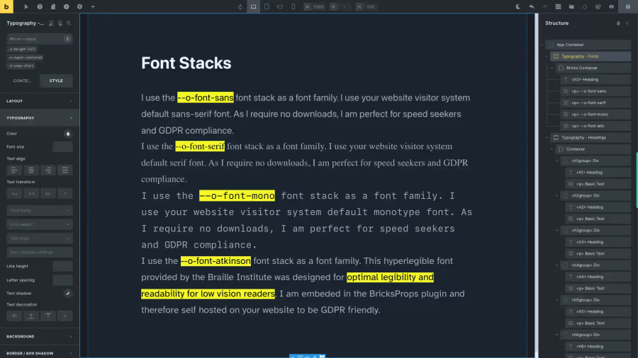
--o-font-sans
link --o-font-sans--o-font-sans The sans serif font stack is --o-font-sans
:where(html) { --o-font-sans: system-ui, -apple-system, Segoe UI, Roboto, Ubuntu, Cantarell, Noto Sans, sans-serif;}The —o-font-sans font family
Lorem ipsum dolor sit amet, consectetur adipiscing elit, sed do eiusmod tempor incididunt ut labore et dolore magna aliqua. Ut enim ad minim veniam, quis nostrud exercitation ullamco laboris nisi ut aliquip ex ea commodo consequat. Duis aute irure dolor in reprehenderit in voluptate velit esse cillum dolore eu fugiat nulla pariatur. Excepteur sint occaecat cupidatat non proident, sunt in culpa qui officia deserunt mollit anim id est laborum.
The font stack system-ui, -apple-system, Segoe UI, Roboto, Ubuntu, Cantarell, Noto Sans, sans-serif is interesting to use because it specifies a range of font families that are commonly available on different operating systems and devices.
The system-ui and -apple-system values are generic font family names that will use the default UI font of the operating system or device, which ensures that the website text will match the overall look and feel of the device or operating system.
The other font families in the stack such as Segoe UI, Roboto, Ubuntu, Cantarell, and Noto Sans are widely used and popular font families that provide good readability and legibility. The sans-serif value at the end is a fallback font family that is used if none of the other font families are available on the user’s device.
By using this font stack, web developers can ensure that their website text is legible, readable, and consistent across different devices and operating systems.
--o-font-serif
link --o-font-serif--o-font-serif The serif font stack is --o-font-serif
:where(html) { --o-font-serif: ui-serif, serif;}The —o-font-serif font family
Lorem ipsum dolor sit amet, consectetur adipiscing elit, sed do eiusmod tempor incididunt ut labore et dolore magna aliqua. Ut enim ad minim veniam, quis nostrud exercitation ullamco laboris nisi ut aliquip ex ea commodo consequat. Duis aute irure dolor in reprehenderit in voluptate velit esse cillum dolore eu fugiat nulla pariatur. Excepteur sint occaecat cupidatat non proident, sunt in culpa qui officia deserunt mollit anim id est laborum.
The ui-serif value in the font stack refers to a font that is designed with serifs and optimized for on-screen use, while the serif value is a fallback that provides a generic serif font. This font stack is interesting because it allows for the use of a serif font that is specifically tailored for screen reading, improving readability and reducing eye strain for users. Additionally, using system fonts like ui-serif can improve website performance by reducing the need to load custom fonts from external servers.
--o-font-mono
link --o-font-mono--o-font-mono The monotype font stack is --o-font-mono
:where(html) { --o-font-mono: Dank Mono, Operator Mono, Inconsolata, Fira Mono, ui-monospace, SF Mono, Monaco, Droid Sans Mono, Source Code Pro, monospace;}The —o-font-mono font family
Lorem ipsum dolor sit amet, consectetur adipiscing elit, sed do eiusmod tempor incididunt ut labore et dolore magna aliqua. Ut enim ad minim veniam, quis nostrud exercitation ullamco laboris nisi ut aliquip ex ea commodo consequat. Duis aute irure dolor in reprehenderit in voluptate velit esse cillum dolore eu fugiat nulla pariatur. Excepteur sint occaecat cupidatat non proident, sunt in culpa qui officia deserunt mollit anim id est laborum.
Using a font stack that includes popular monospace fonts like Dank Mono, Inconsolata, and Source Code Pro can improve the readability and legibility of text content on a website or application. Monospace fonts are designed with fixed-width characters that align horizontally, which makes them an ideal choice for coding, terminal, and other technical contexts where visual clarity is critical. Including fallbacks like ui-monospace and monospace ensures that the text will display legibly on a wider range of devices and browsers.
The ch unit is a relative unit that is based on the width of the character “0” in the font that is specified. In non-monospace fonts, using ch can result in slightly varying widths, as characters may have different widths depending on their shape. However, when using a monospace font, each character has an equal width, so the ch unit will always be equivalent to the width of a single character. For this reason, OxyProps uses ch as the default unit for text width. When using the --o-font-mono family, this ensures that 60ch will always be exactly 60 characters wide, regardless of the specific characters used.
--o-font-atkinson
link --o-font-atkinson--o-font-atkinson The atkinsontype font stack is --o-font-atkinson
:where(html) { --o-font-atkinson: 'Atkinson Hyperlegible', var(--o-font-sans), sans-serif;}The —o-font-atkinson font family
Lorem ipsum dolor sit amet, consectetur adipiscing elit, sed do eiusmod tempor incididunt ut labore et dolore magna aliqua. Ut enim ad minim veniam, quis nostrud exercitation ullamco laboris nisi ut aliquip ex ea commodo consequat. Duis aute irure dolor in reprehenderit in voluptate velit esse cillum dolore eu fugiat nulla pariatur. Excepteur sint occaecat cupidatat non proident, sunt in culpa qui officia deserunt mollit anim id est laborum.
Atkinson Hyperlegible is a font designed specifically for readability and legibility. It was created by Applied Design Works in collaboration with the Braille Institute, and its primary purpose is to make reading easier for people with visual impairments and dyslexia.
The font features a unique design with exaggerated and open letterforms, high contrast between thick and thin strokes, and generous spacing between letters, making it easier to distinguish each character. The design also includes unique letterforms for characters that can be easily confused, such as “l” and “1”, “p” and “q” or “O” and “0.”
The Atkinson Hyperlegible font has gained popularity beyond its intended audience due to its exceptional legibility and clean design. It is a great option for anyone looking to improve the readability of their website or printed materials.
The Atkinson Hyperlegible font is embeded in OxyProps, so you can use it without having to download any additional files.
Available as CSS variables and utility classes
link Available as CSS variables and utility classes| Description | CSS Variable | Utility Class |
|---|---|---|
| Sans serif, user system | --o-font-sans | o-sans |
| Serif, user system | --o-font-serif | o-serif |
| Monotype, user system | --o-font-mono | o-mono |
Also available as a font families in the Oxygen and Bricks editors
link Also available as a font families in the Oxygen and Bricks editorsOxyprops registers the four font families in the Oxygen editor.
You can use them in your global styles as any registered font.
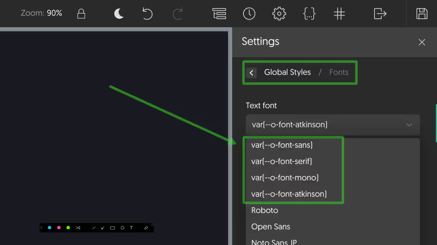
You can also find them in the font-family drop-down, in the typography section of the editor when styling an element.
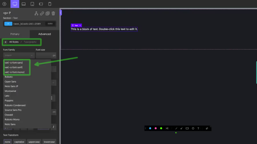
Oxyprops registers the four font families in the Bricks editor.
You can use them in your theme styles as any registered font.
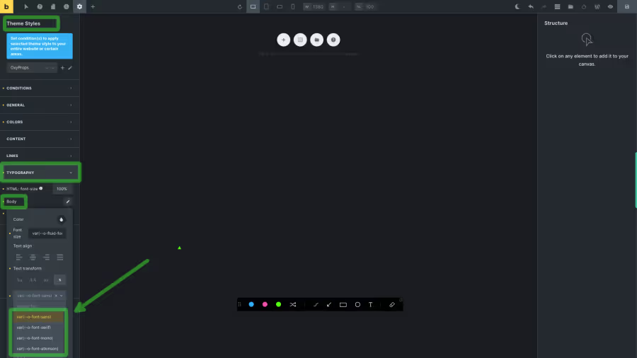
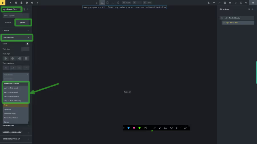
You can also find them in the standard fonts section of the font-family drop-down, in the typography section of the editor when styling an element.
